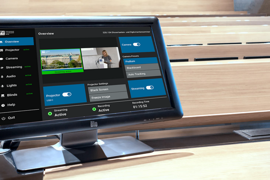
Redesign of lecture hall touch panels
The TU Workplace Control Centre assists instructors and exam supervisors in securely and efficiently managing courses and exams. The project's objective was to devise a contemporary, adaptable system that would centrally manage rooms, workstations, and examination desktops. The system has been designed to be clear and intuitive, focusing on user needs to minimise the risk of errors.
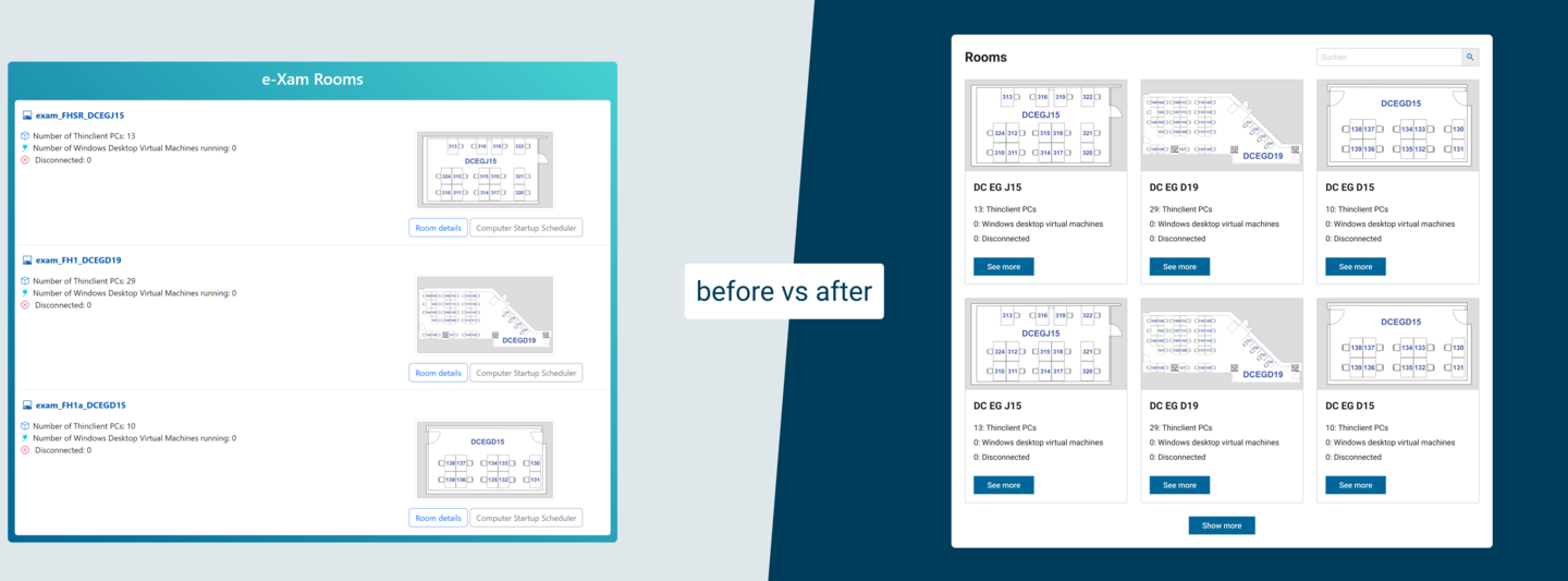
Before
After
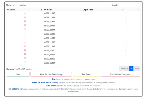
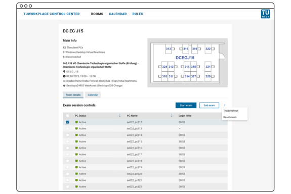
The system facilitates the initiation and conclusion of exams on exam desktops, the management of application and firewall rules, and provides clear calendar and room views. Careful implementation of UX/UI improvements highlights critical actions, streamlines navigation, and creates an intuitive user experience.
![[Translate to English:] Ein digitaler Kalender zeigt am 29. September ein Popup-Ereignis mit dem Titel „Mathematik Prüfung“ an, zusammen mit Details zu aktiven Regeln und Firewall-Richtlinien.](/fileadmin/_processed_/c/0/csm_CS_TUworkPlace_Ist_2_d2cd6cf7ad.png)
Before
![[Translate to English:] Eine digitale Kalenderoberfläche mit einem Popup-Fenster zur Terminplanung für eine Veranstaltung mit dem Titel „Chemische Technologie“. Optionen für Raum und Datum sind sichtbar.](/fileadmin/_processed_/e/8/csm_CS_TUworkPlace_Ergebnis_2_958fab361b.png)
After
As part of the project, existing workflows were analysed to identify pain points and user experience (UX) issues. Following this process, concrete recommendations for improving user guidance were developed and prioritised based on low effort/high impact. Additionally, a UX/UI guide was created, along with a Figma design that illustrates the recommended optimisations and adheres to the TU Design System guidelines.
We continue to be very impressed with the Figma mockups and wireframes, which are regularly used as a reference, and we continuously refine the UI elements to better align with them.
The result is a clear and intuitive interface that highlights frequently used actions, such as “Start exam” and “End exam”, while less common functions, such as “Reset” and “Troubleshooting”, remain secondary. The calendar and room views improve orientation, and the documentation supports both users and developers in effectively managing the system.
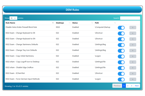
Before
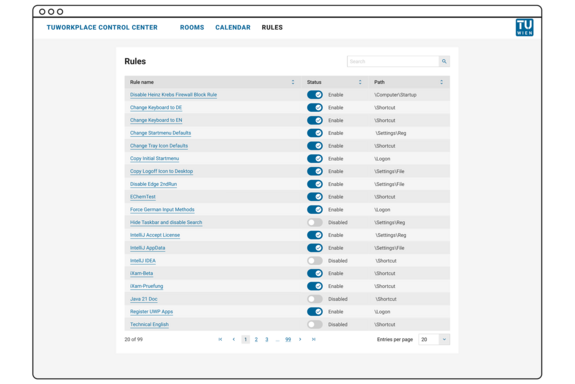
After
These measures have helped reduce errors during exams, simplify the onboarding of new supervisors, and lay the groundwork for the gradual expansion to additional rooms and users. At the same time, implementing the recommendations in a pragmatic and resource-efficient manner has improved development efficiency. This project shows how targeted UX/UI improvements can greatly improve the user experience while keeping technical demands to a minimum.
